Timesheet
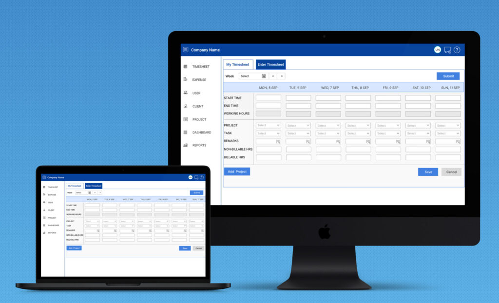
Timesheet is a powerful SaaS solution designed to simplify and automate daily work submissions for businesses of all sizes. With an intuitive interface, employees can easily log their work hours, assign tasks to projects, and track their productivity in real time. The system ensures accuracy in time tracking by allowing users to categorize work entries, add descriptions, and submit them for approval. Whether for remote teams or in-office employees, Timesheet enhances transparency and accountability, making workforce management more efficient.
My Role
UI-UX Designer, Front-End Developer
Research and Analysis
- User research
- Competitor Analysis
- User Persona
- Empathy map
- Process Flow Diagram
Design Deliverables
- Wireframes
- Prototyping
- Design System
- Component Library
- Design Hand-off
Development & Testing
- Development
- Unit Testing
- System Testing
- Usability Testing
- User Acceptance Testing
Tools
- Pen and Paper
- Figma
- FigJam
- Wireframe.cc
- Zeplin
Technologies
- Angular
- TypeScript
- Node JS
- Express JS
- MongoDB
Problem Statement
How to avoid repetitive process of timesheet submission and save the user’s time and efforts?
Solution
Automate the whole process and hence improve the user experience and efficiency.
Research and Discovery
Primary User Research
By primary user research, I organizationally depicts the three key tasks to focus on:
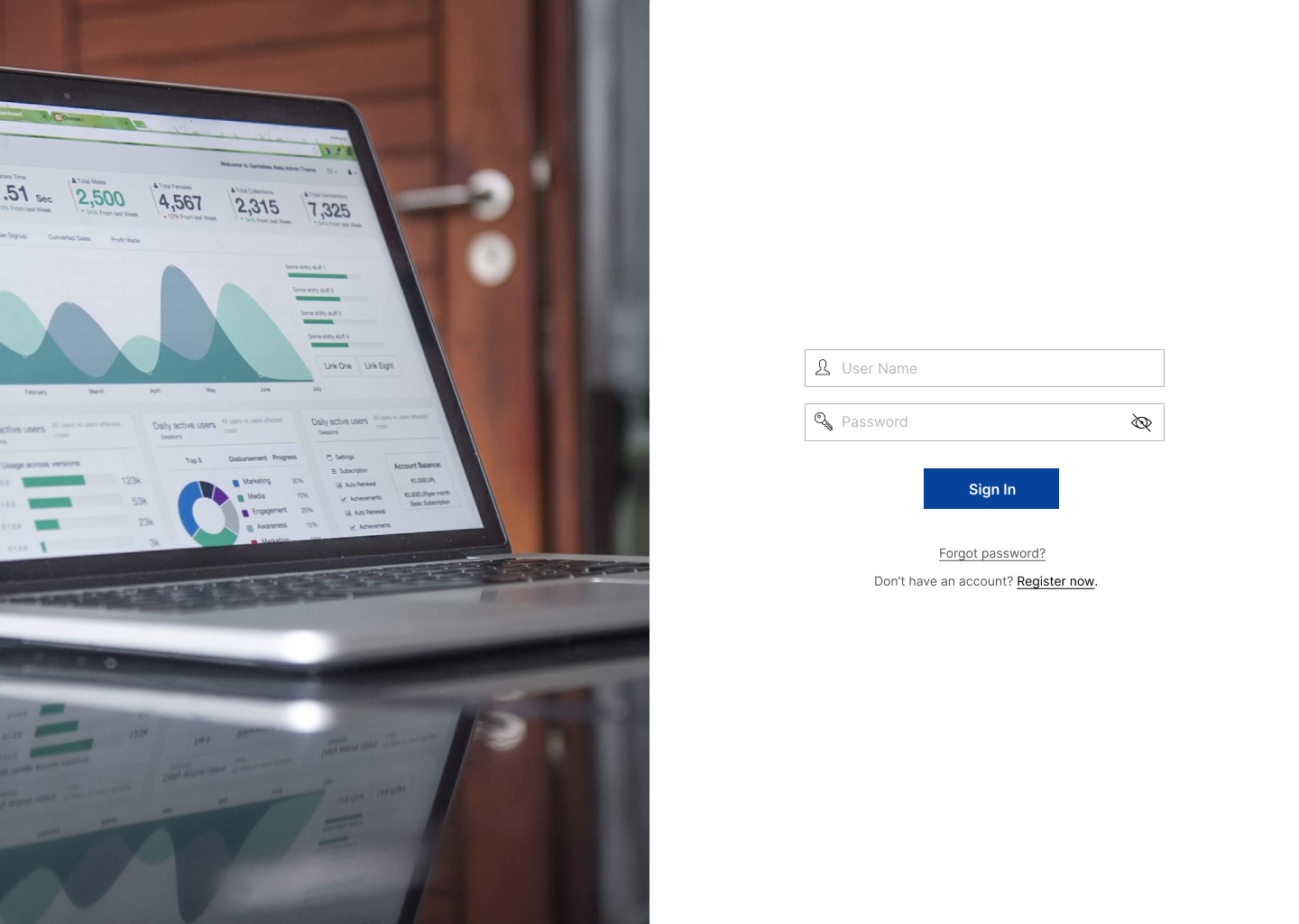
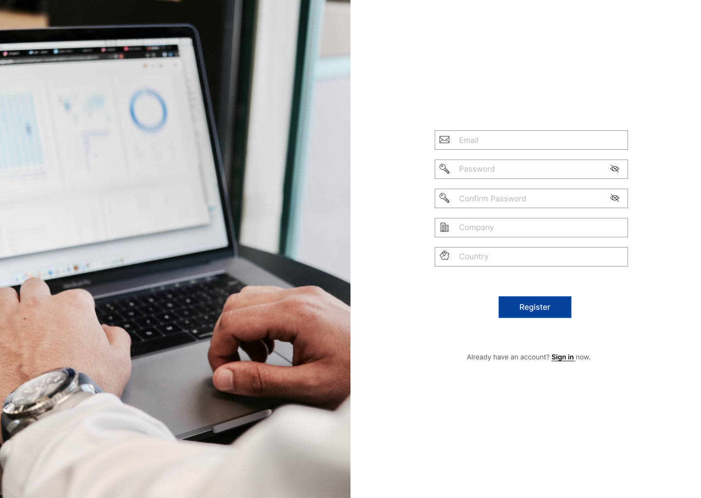
1. Onboarding and registration of user
2. Project Management
3. Timesheet addition and submission related functions.
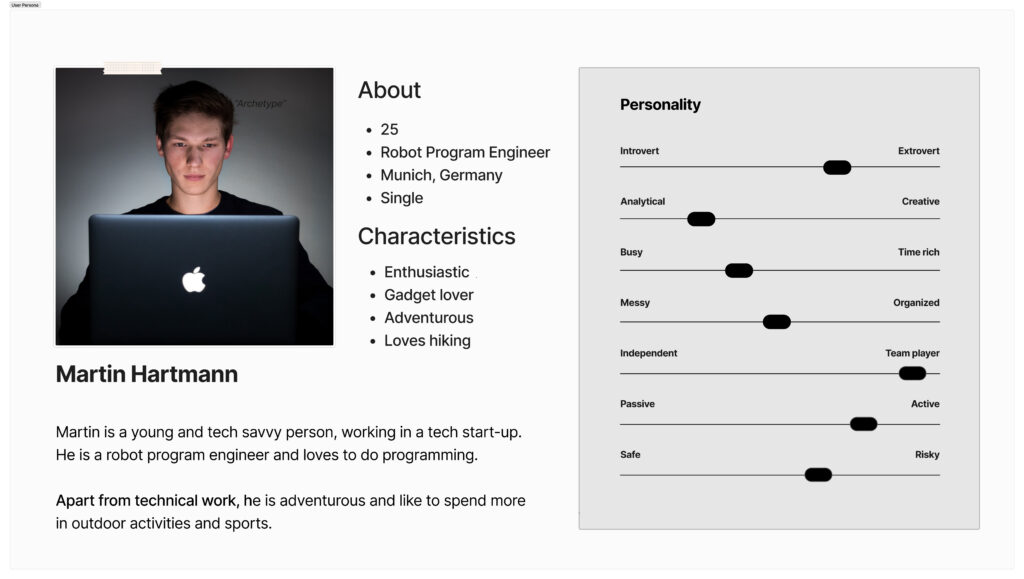
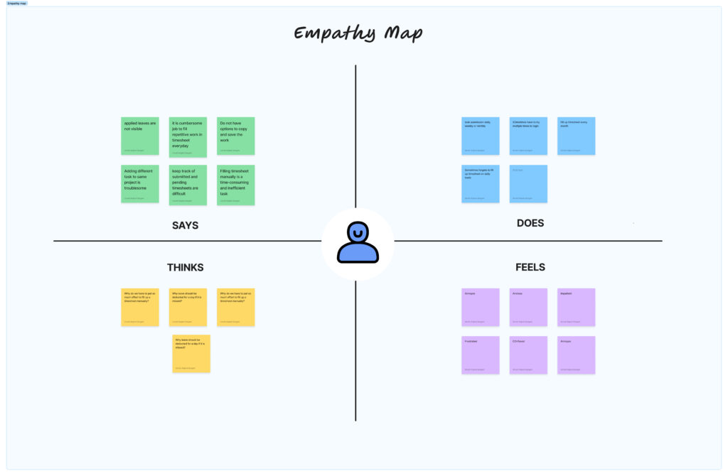
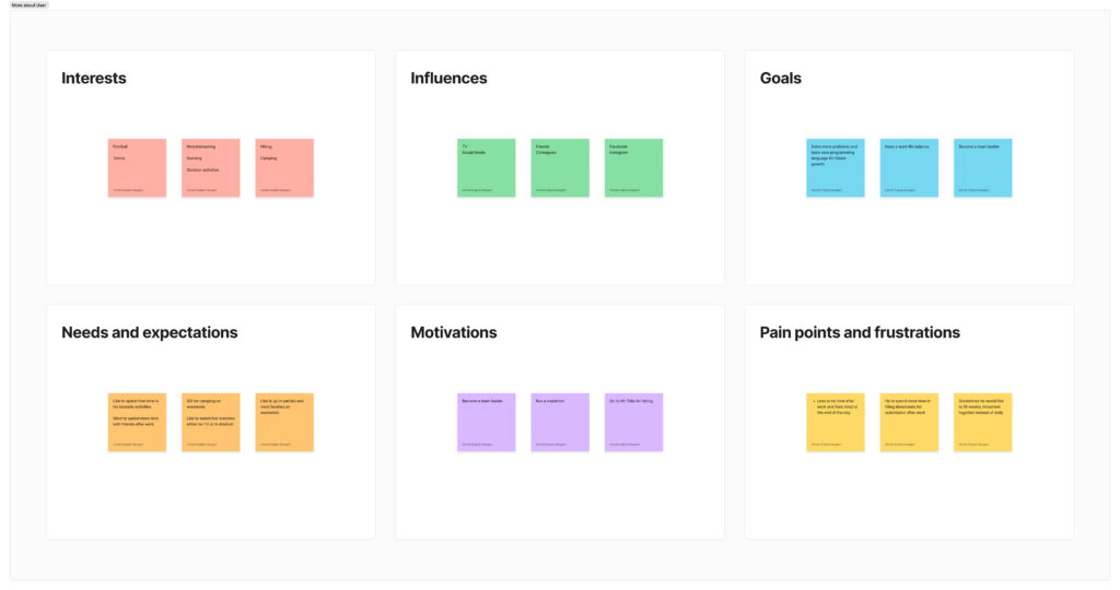
I have created user persona and empathy map based on few user interviews from the organization.
User Persona
Empathy Map
Discovery of pain points
After user research and analysis we found following pain points of user:
- Manual way of filling and submitting timesheet on a daily basis is time-consuming process
- Can not save the same copy of work
- Manually management of project, team, and task allocation
- Difficult to manage multiple timesheet of team members came in different formats
- Keeping track of tasks and its status is very problematic
Use Cases and Process Flow
Use Cases
Mapped out detailed user journeys to visualize the entire experience, identifying touchpoints and pain points. Created comprehensive process flows for both Team Members and Team Leaders, ensuring optimal user interaction and a seamless process.
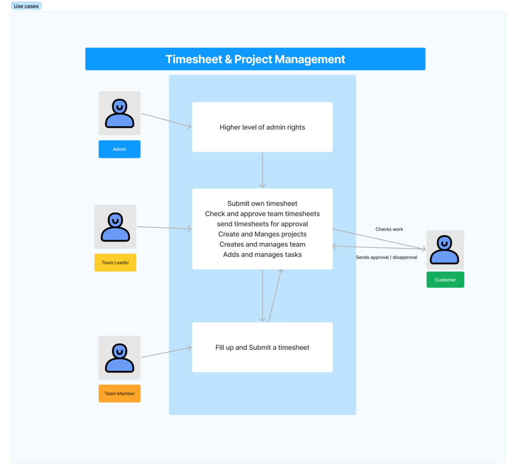
Process flow
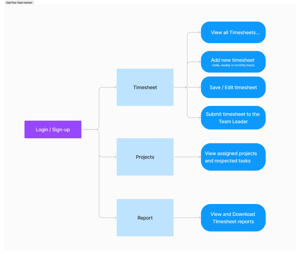
Conducted detailed process analysis, resulting in comprehensive process flows for distinct user roles within the application.
For Team Member
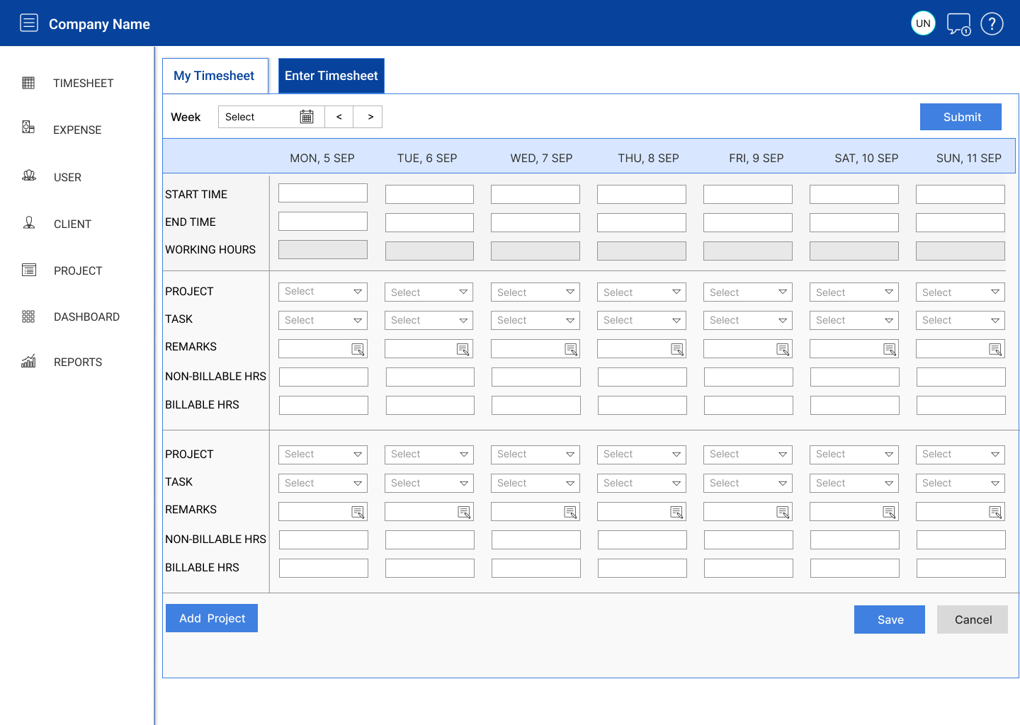
- Streamlined the onboarding process, enabling team members to efficiently enter and save timesheet data.
- Developed a seamless submission process for timesheets, allowing easy approval by Team Leaders.
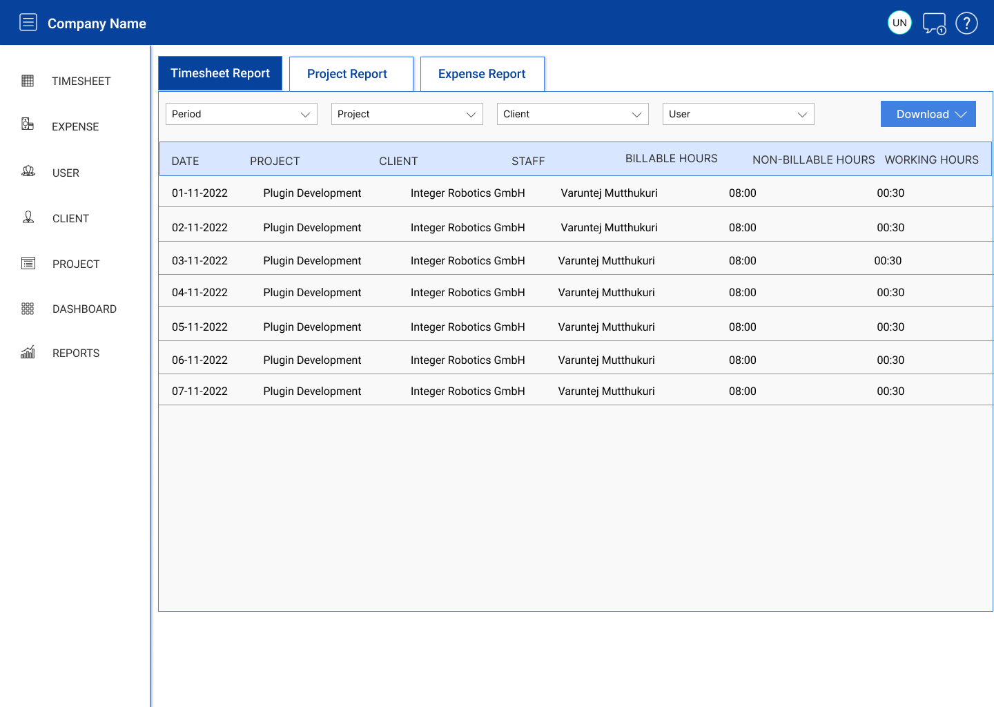
- Implemented advanced timesheet reporting and download functionalities.
- Enhanced profile management features for improved user experience.
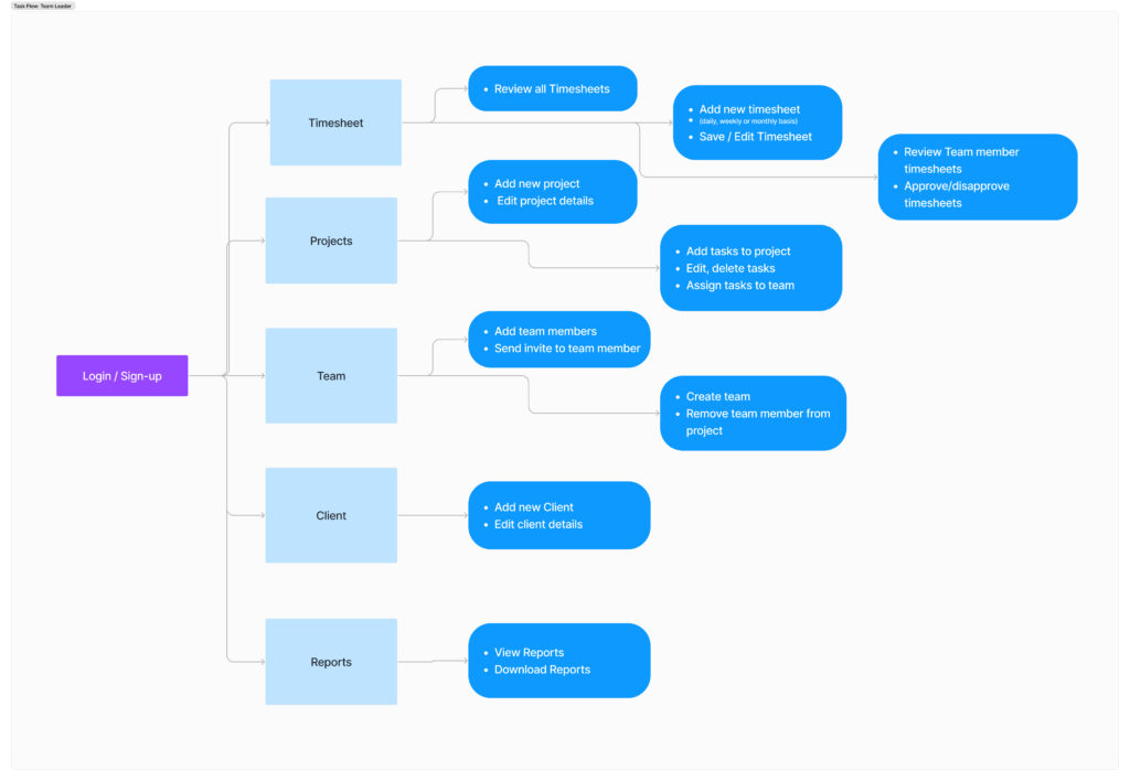
For Team Leader
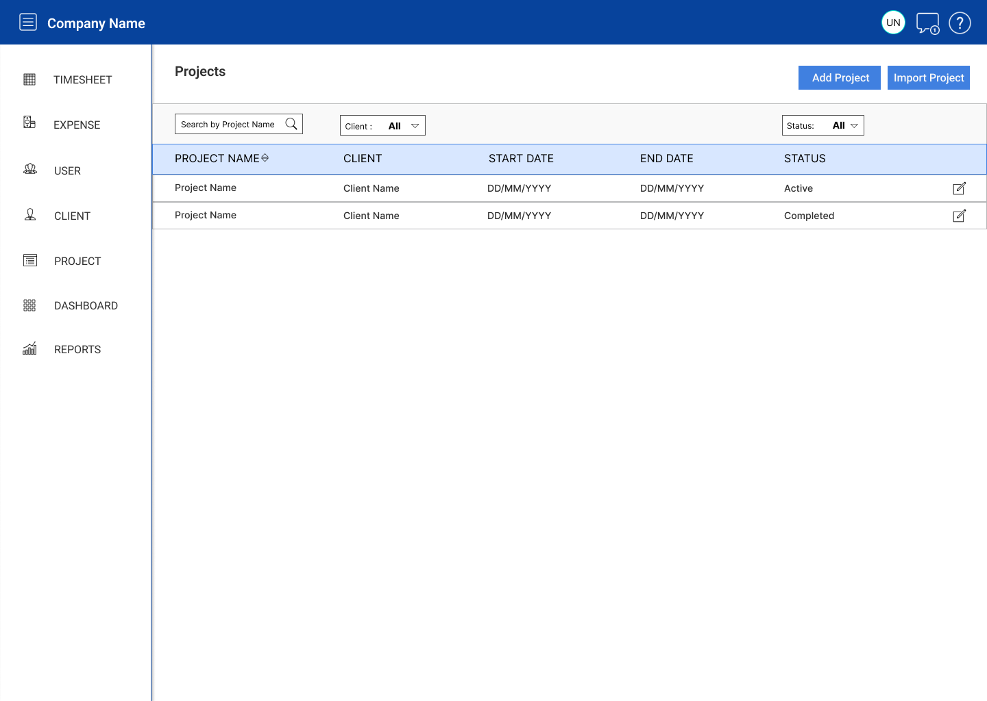
- Designed intuitive features to manage team members, projects, and clients.
- Created an efficient system for allocating team members to various projects.
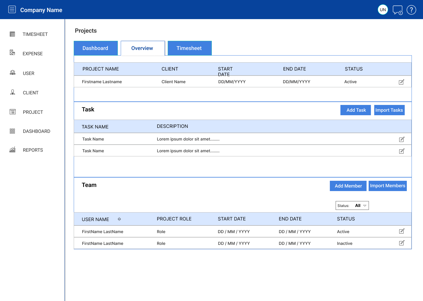
- Crafted a project overview page with comprehensive metrics for individual project analysis.
- Enabled Team Leaders to review, approve, and reject team member timesheets.
- Designed robust reporting and analytics capabilities at both project and month levels.
Design and Prototyping
User-centered Design
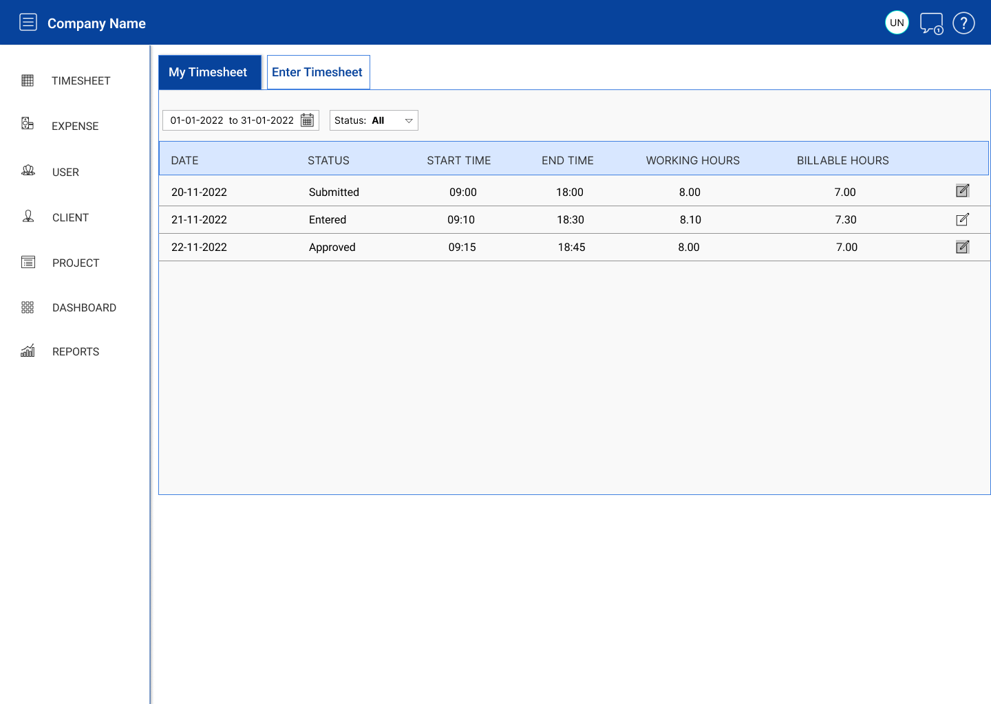
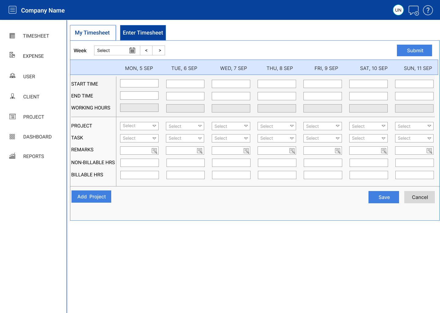
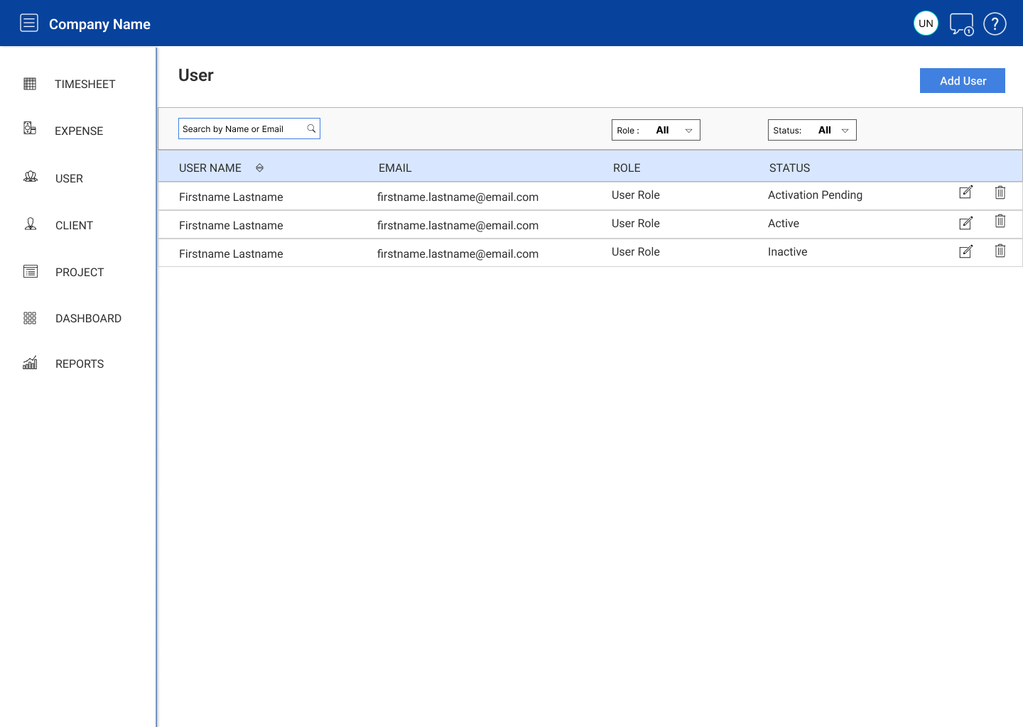
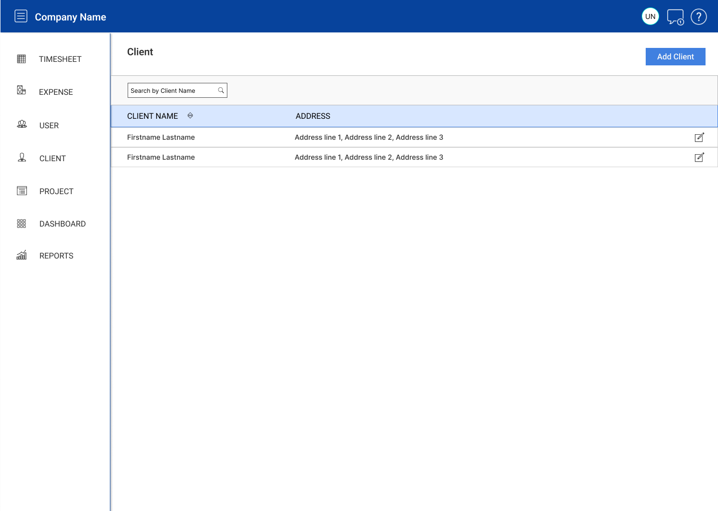
Developed low-fidelity wireframes to establish the basic structure and flow of the application. Collaborated with stakeholders to refine wireframes based on feedback. Transitioned to high-fidelity mockups and prototypes using tools like Figma, adding visual elements and interactive features for a realistic user experience.
Design System and Component Library
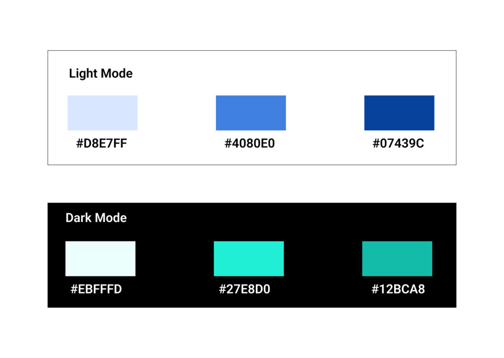
Created a design system and component library to maintain consistency across the application. Defined typography, color palettes, buttons, form elements, and other UI components. Ensured a cohesive visual identity and a seamless user interface.
Establishing Visual Design
Visually articulating all potential aspects of the TackTime product meant defining a baseline design system that identified key elements of its visual vocabulary. I wanted its visual design to always refer back to its core mission: Empowering team leaders and team members.
Predominantly blue palettes imbued screens with a sense of calm and control; simple button states and clear iconography would help make tasks feel more manageable; and a single, modern sans-serif with large, open counters ensured legibility and clarity in messaging.
Result
The project’s outcome significantly improved efficiency, accuracy, and user satisfaction in time tracking and project management processes. The new Time Tracking application transformed the time management process for the organization. By incorporating user-centric design principles and a robust architecture, the application streamlined project-related activities and significantly reduced manual efforts. The new design system enabled easy scalability and maintenance, fostering a consistent and efficient user experience.