ParkEasy
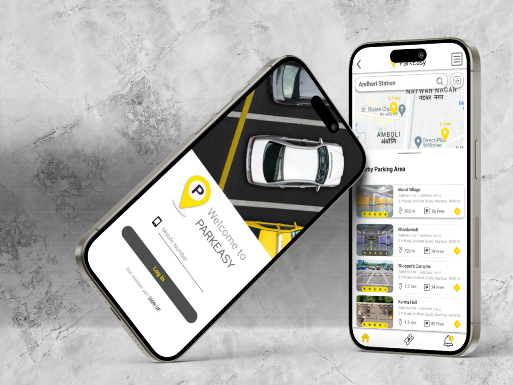
ParkEasy provides one stop platform for people to find nearby parking places and book it online in advance. People no longer will have to worry about finding parking area when driving through busy city roads.
Role
UI-UX Designer, Interaction Designer
Research and Analysis
- User Interviews
- Surveys
- Competitor Analysis
- User Persona
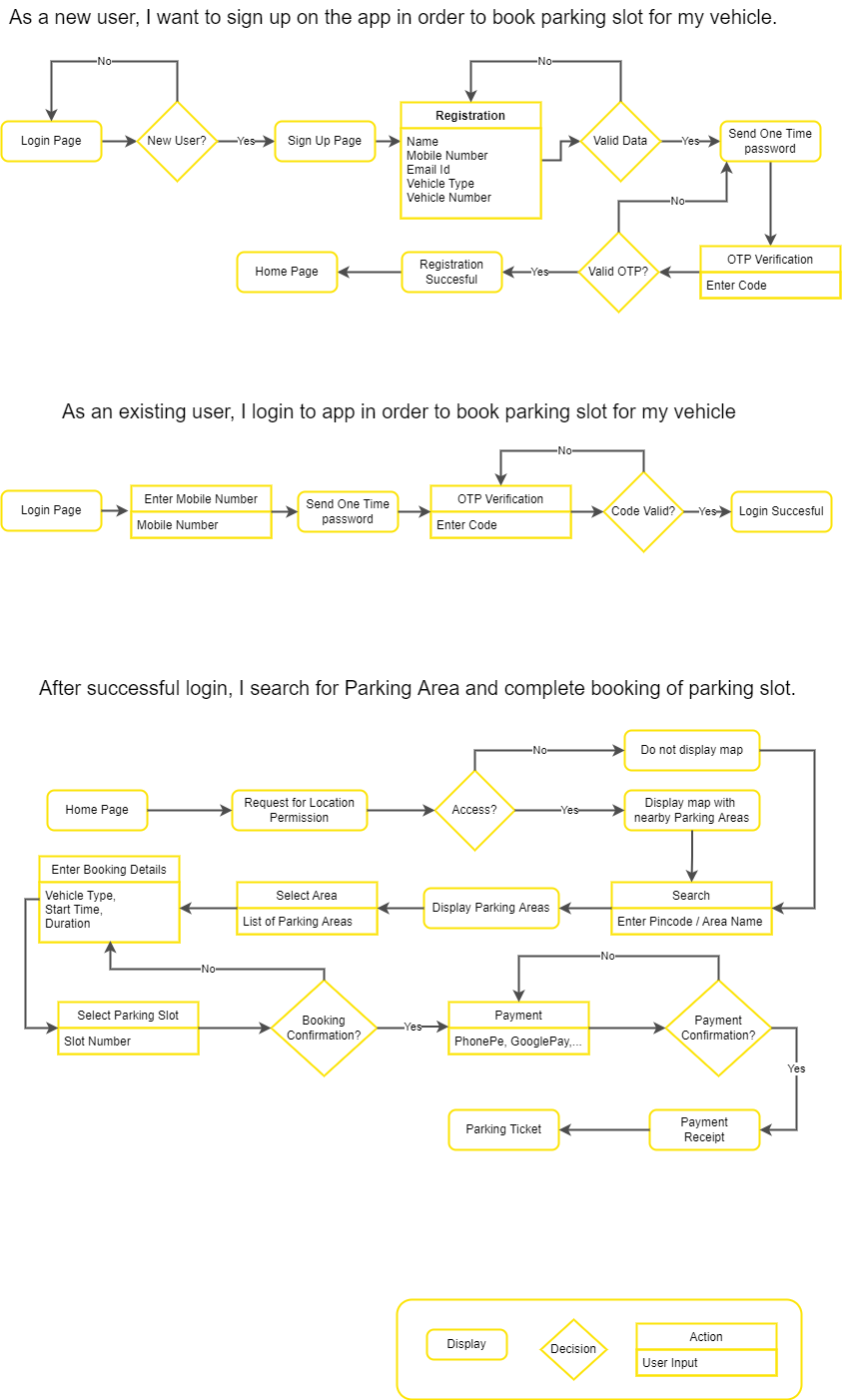
- User Flow Diagram
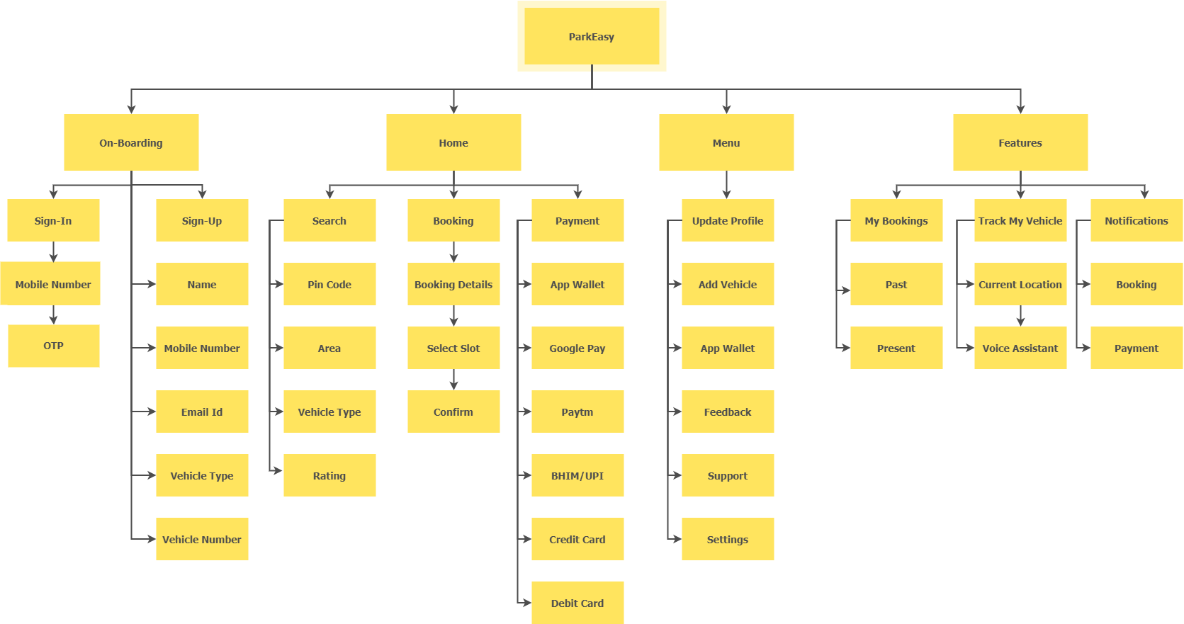
- Information Architecture
Design Deliverables
- Sketch
- Wireframe
- Mid-Fidelity Prototype
- Style Guide
- Usability Testing
- Clickable Prototype
Tools
- Figma
- Photoshop
- Illustrator
- Balsamiq
Problem Insights
In large cities, the number of vehicles is increasing every year. With more urbanization and an improved standard of living, more cars will be seen driving on the road. However, this is leading to problems of not finding open parking spaces.
- It takes much time to search for open vehicle parking places in urban cities.
- Lack of ability to find nearby parking places and book them in advance while driving in a city.
- More fuel is consumed driving around looking for parking places causing more CO2 emissions.
Solution
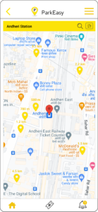
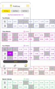
- This platform will help users to find parking places nearby or at designated locations. It also enables users to select a parking area and book a parking slot for their vehicle.
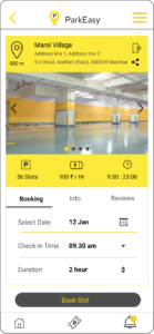
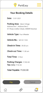
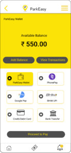
- It allows user to select parking duration, start time and end time , and user have multiple online payment options using which he/she can easily pay the parking charges in advance
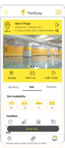
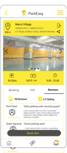
- It also provides details about parking place like is it a open place or a covered area, if it have multi-story parking, if it have automated parking or valet parking facility and such that.
User Research

User Interviews
At the discovery phase of my project, I conducted one-to-one user interviews in order to get a better understanding of the problem. I conducted interviews with my colleagues, friends, neighbor and cab drivers.
Sample Questions
- How do you book a parking spot for your vehicle?
- How is your experience with the apps you are using?
- Are you able to book the parking slot with the app?
- Is the option of the digital payment is available?
- What are the features you are looking for in a parking app?
- Do you often forget the spot of parked vehicle?
Surveys
To better understand the user needs for gardening products and services, I conducted a user survey with different demographics.
94%
people prefers to book parking spot in advance of their travel.
82%
people prefers to pay online for booking of parking spot.
75%
people prefers to get notifications about start-time and end-time of their parking.
68%
people prefers subscription-free usage of basic features of the app.
Competitior Analysis
I gathered information about the current and potential competitors in order to define basic features of our application.
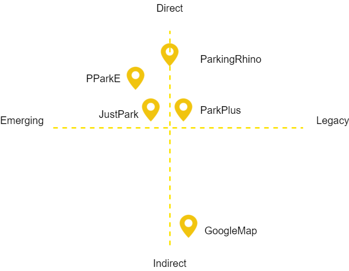
Key Inputs from the user research
We interviewed a few people, and most of them stated that they were struggling to find a parking place for their vehicles and had to spend more time searching for the open spot. Some people even said they would like to see availability for two-wheeler bikes or scooters as they would ride the same instead of a car.
Below are general points I found after user research and competitive analysis:
- People want to access an app to search the parking area before they start their journey and not just during the trip.
- People prefer to book the slot and pay the charges online in advance.
- People want to get information about their parking area like charges per hour, safety and security, electric charging station, etc.
Personas
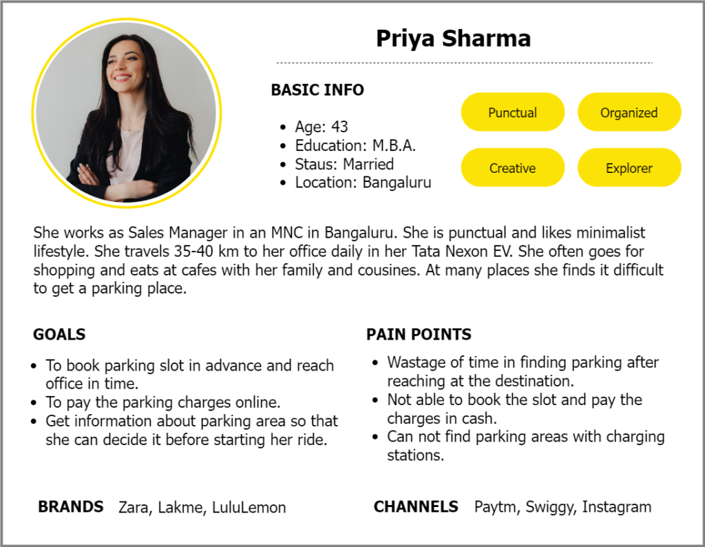
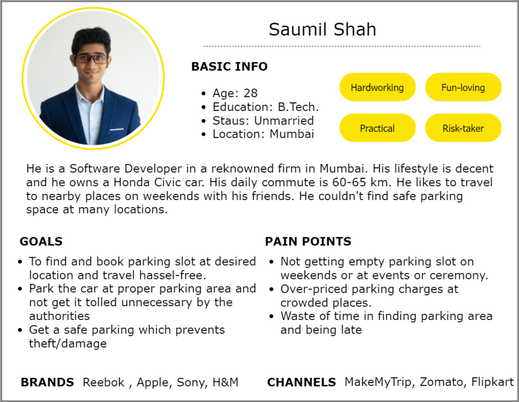
Based on the interviews/surveys I made up two personas. The main goal is to display those patterns and pain points, which allowed me to further empathize with users. I referred to them throughout the entire app development process.
I use inputs from my user research and insights of my stake holders to make these personas.
Define
Design
I usually start the design process with low fidelity wireframes. This is the way I iterate through many design options quickly. Here are the initial sketches made on paper with pencil.
Wireframes
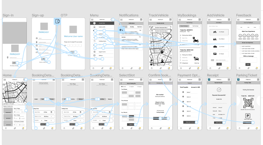
At the beginning of my design process I created mid-fidelity wireframes in Figma. My wireframes in gray-shade because it for testing purposes. I have made 3-4 iterations.
User Testing
I have conducted 6 user tests to check the functionality of the app. I have performed the testes in person and remote using the tool Usability Hub. After the tests, I got many valuable insights from user. I made some changes in my design to incorporate the inputs from the test result. Below are the few examples of them:
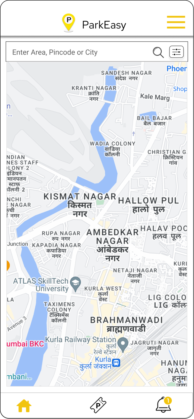
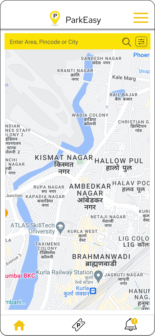
Make search bar more visible
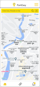
On the Home screen, search bar was displayed on the map with transparency which makes it less visible. New placement of the search bar makes it more visible and accessible to the user.
Cancel Button on the Summery Page
After choosing slot, if user wants to cancel or change any detail there was cancel button. So I added cancel button on the page.
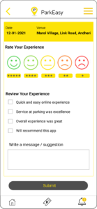
Area Details on Feedback Page
I have added the Parking Area name and Date which makes the feedback details more accurate.
Final Delivery
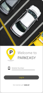
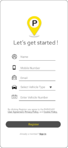
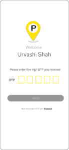
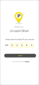
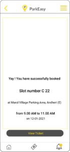
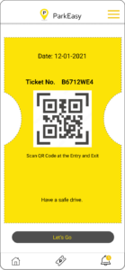
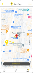
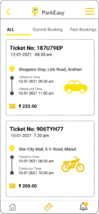
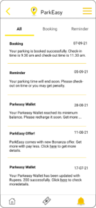
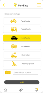
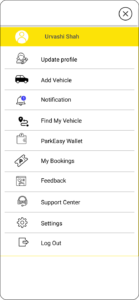
Once I resolved out usability mistakes, I started designing the final screens in Figma. I designed some icons for the app in Illustrator.
Final Screens
